
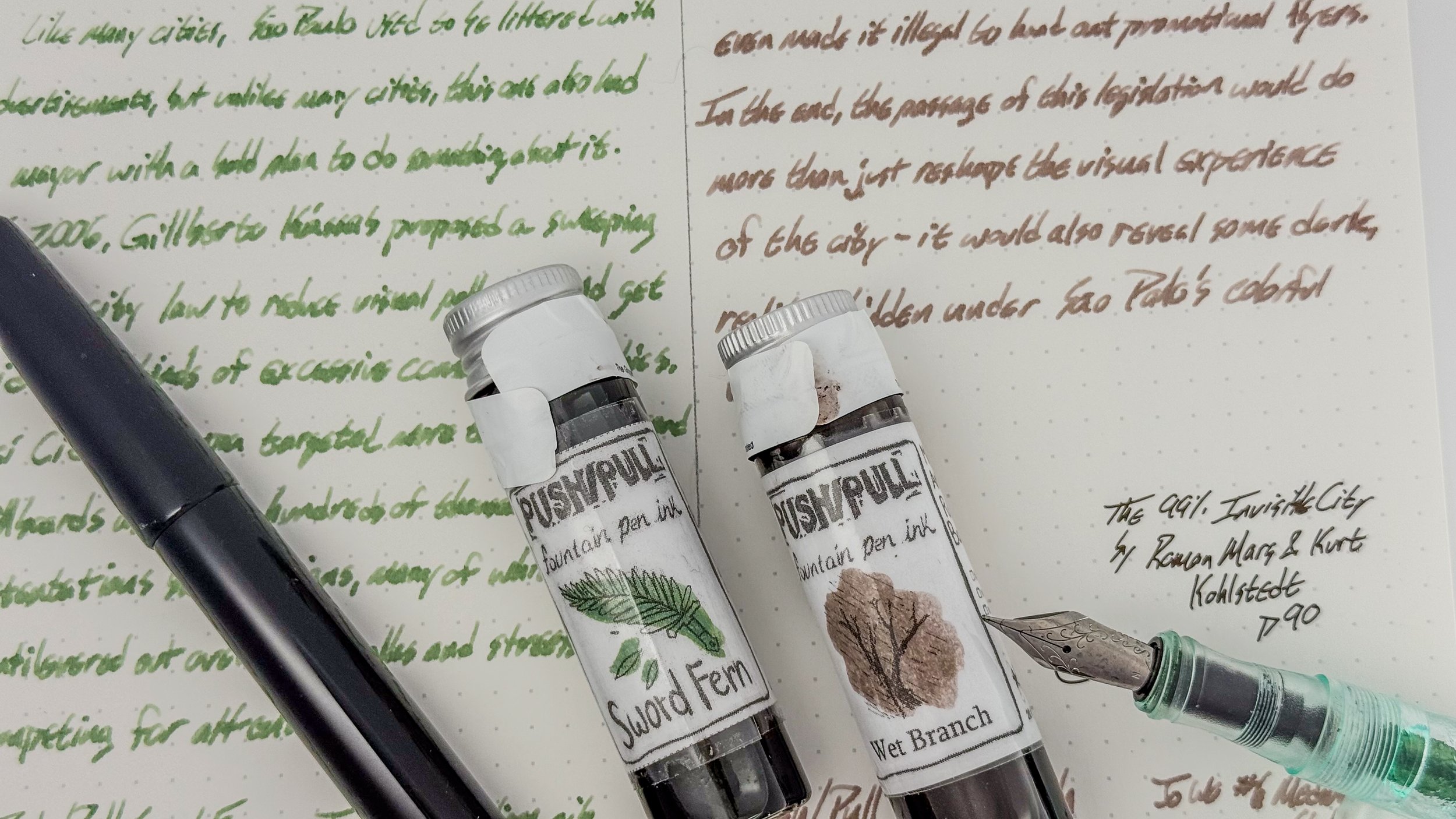
Push/Pull Sword Fern & Wet Branch
A pair of inks from a new-to-me brand! I wish I could give them a good review…
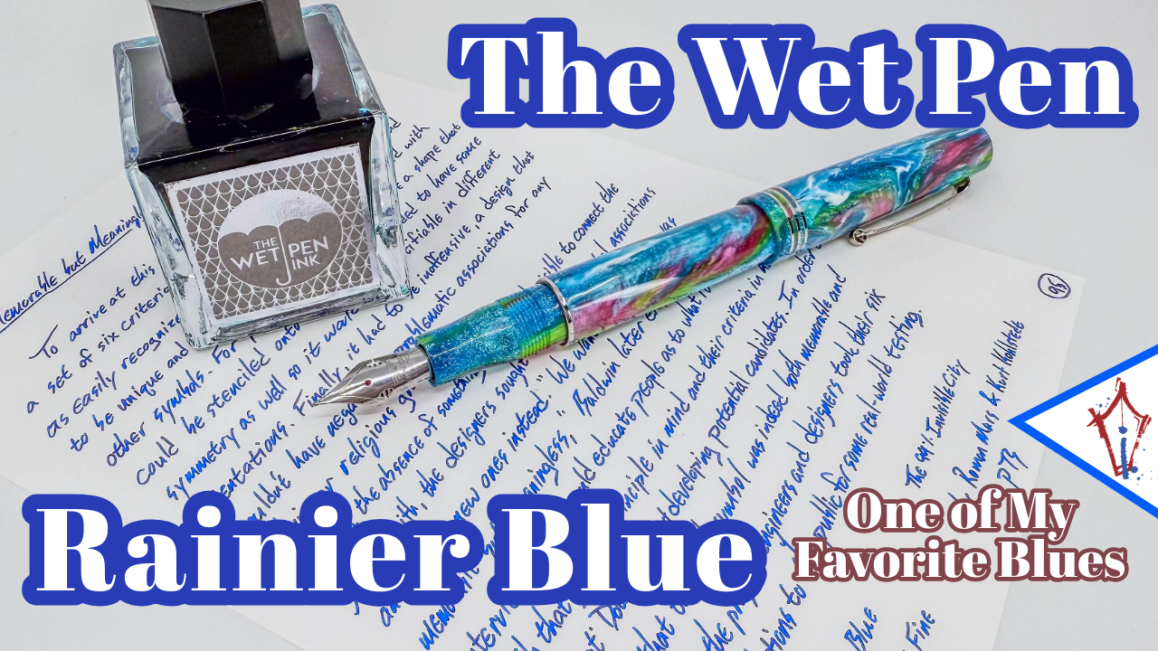
The Wet Pen Rainier Blue
This is one of my favorite blues, and I bet you’ll like it too.
I just can’t spell it.

KWZ “Meet Me in St. Louis - 314 Blues”
The 2025 St. Louis Pen Show Exclusive!

Nagasawa Kobe #22 Monogatari Shinkaichi Gold
The weirdest Kobe ink? Probably!

Octopus Fluids Write & Draw Orange Bunny
This cover-card is so YouTube coded. I don’t usually like doing that, but this one earned the nearly-click-bait title.

Platinum’s 3776 Shape of Heart Bluebird

The Wet Pen’s Elliott Bay
This is just an awesome blue ink.

Lennon Tool Bar’s Want
Is this the one you’ve been Wanting? Or will it leave you Wanting…

Tom’s Studio Wren

The Carolina Pen Co. Convert!

No Foolin’: Deception Pass

Midori Dark Red

Figuring it out!

Franklin-Christoph's New Ink: Bronze Age!
A great color, and it rinses out super cleanly.

Chicago Pen Show 2024: Papier Plume's Faceless Lady
This is a limited edition that I wish was permanent!

#21Questions from Well Appointed Desk
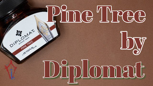
Diplomat Pine Tree

Aurora Sepia Special Edition

Wearingeul x Pen Chalet Taming of the Shrew

Pennonia x Cult Pens' Arvacska
This is just one of my favorite inks of all time. It’s such a great purple!