
Teranishi Guitar Taisho Roman Haikara Antique Black
Okay, this ink is great. The color is good, the flow is nice. It performs pretty well on bad papers, and there’s some shading and sheen to keep it interesting. This isn’t really a black ink, though. It’s really a brown. I think the camera shots here really bring out the sheen and that brown character, but it generally looks pretty black on most papers.
These Teranishi inks are really very good. I don’t know if I have fond any that I don’t like. I’d say you should take a look at the whole line and take a swing at any that you like the look of. I got this sample from a friend, but you can find it at stores like The Gentleman Stationer and Vanness Pens. (I have discount codes for both of those, so check out my Affiliate Links page.)
The full name is a whole lot, though.
I’m tellin’ you. This ink looks more black that brown most of the time. The camera and lights really brought out the sheen in this ink.
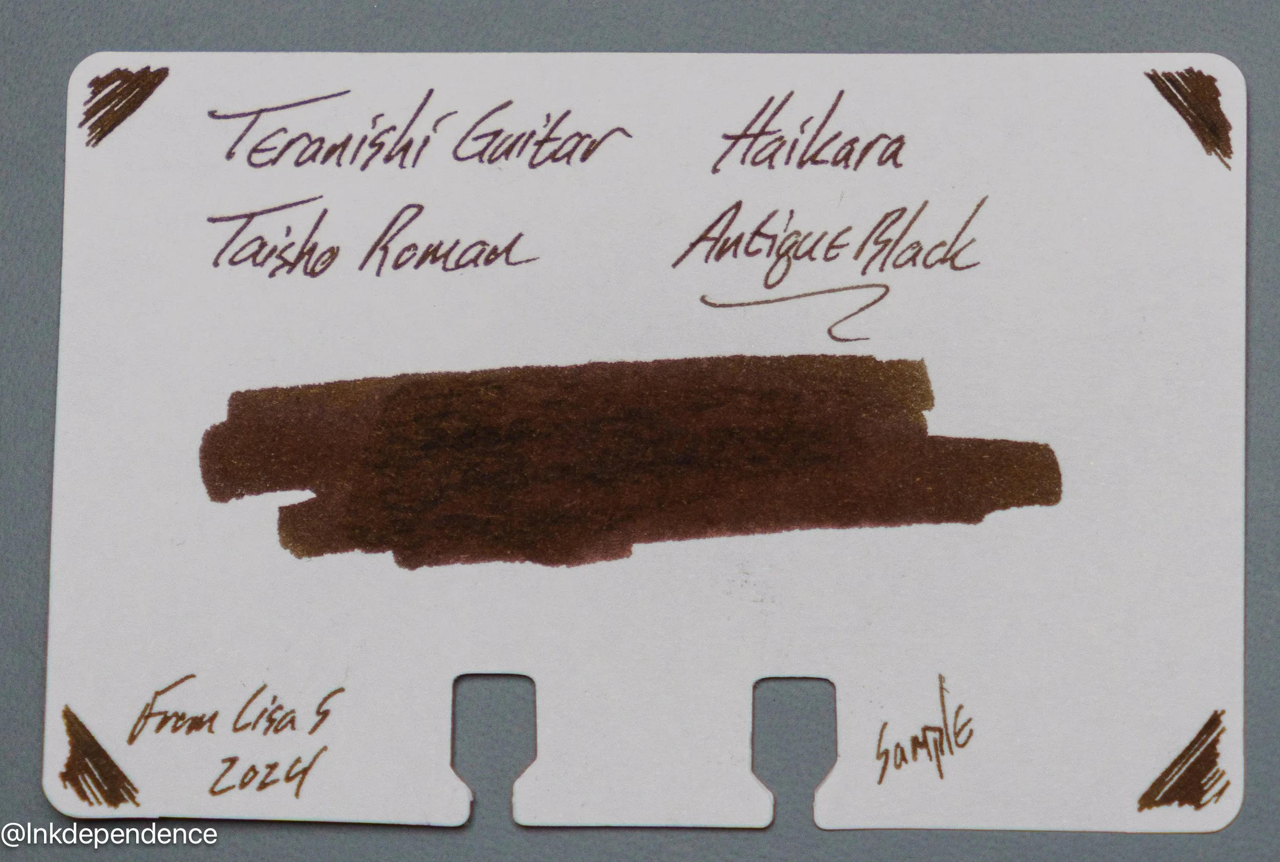
The water resistance of this ink is sort of middle-of-the-road. The brown/black washes away, but the blue sticks to the page pretty well. As you can see from the chromatography, it’s a pretty complex ink with several dyes coming together to give it that interesting character.
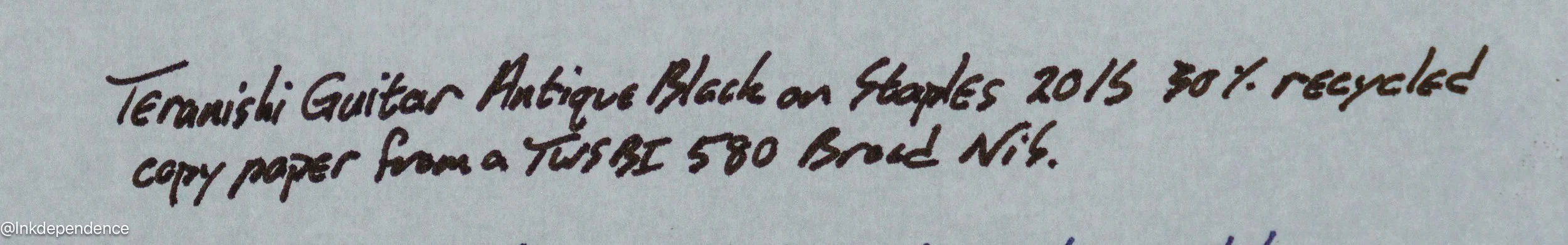
I think this is pretty good performance for this ink on a recycled copy paper from a broad nib. This paper isn’t meant for liquid inks, and most things will bleed a little. Or more. So, if it weren’t a broad nib it would probably not show through even this much.
This is some of my favorite paper, lately. It’s thin, but not too thin, and it works great with fountain pen inks.
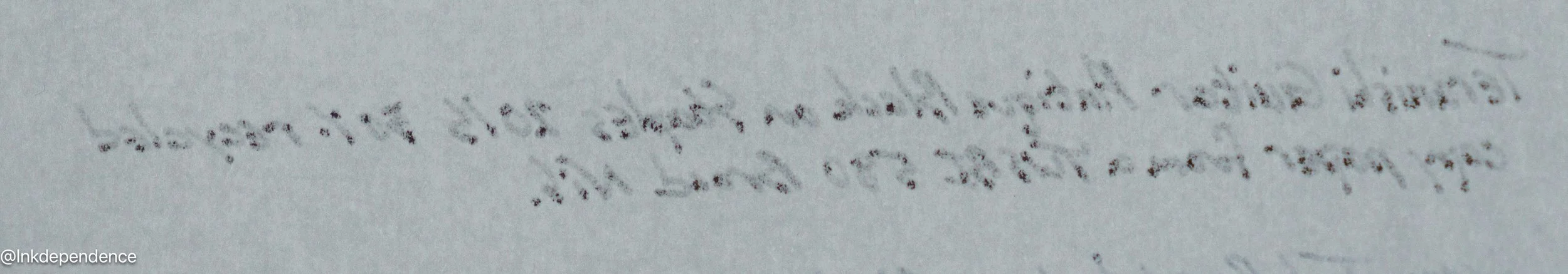
This is a close up from the writing sample above.
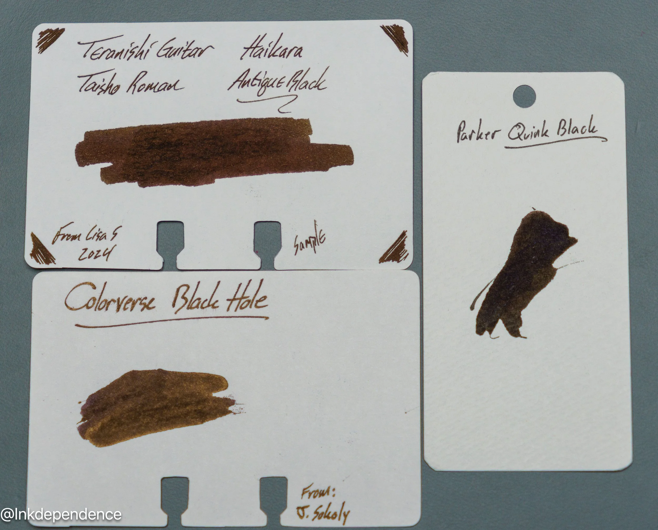
I compared it to another shiny blackish ink here, as well as a very dark black in the Parker Quink.