Do you have an ink dependence? I can help...

Image Slider

Monteverde Erinite

10/15/18

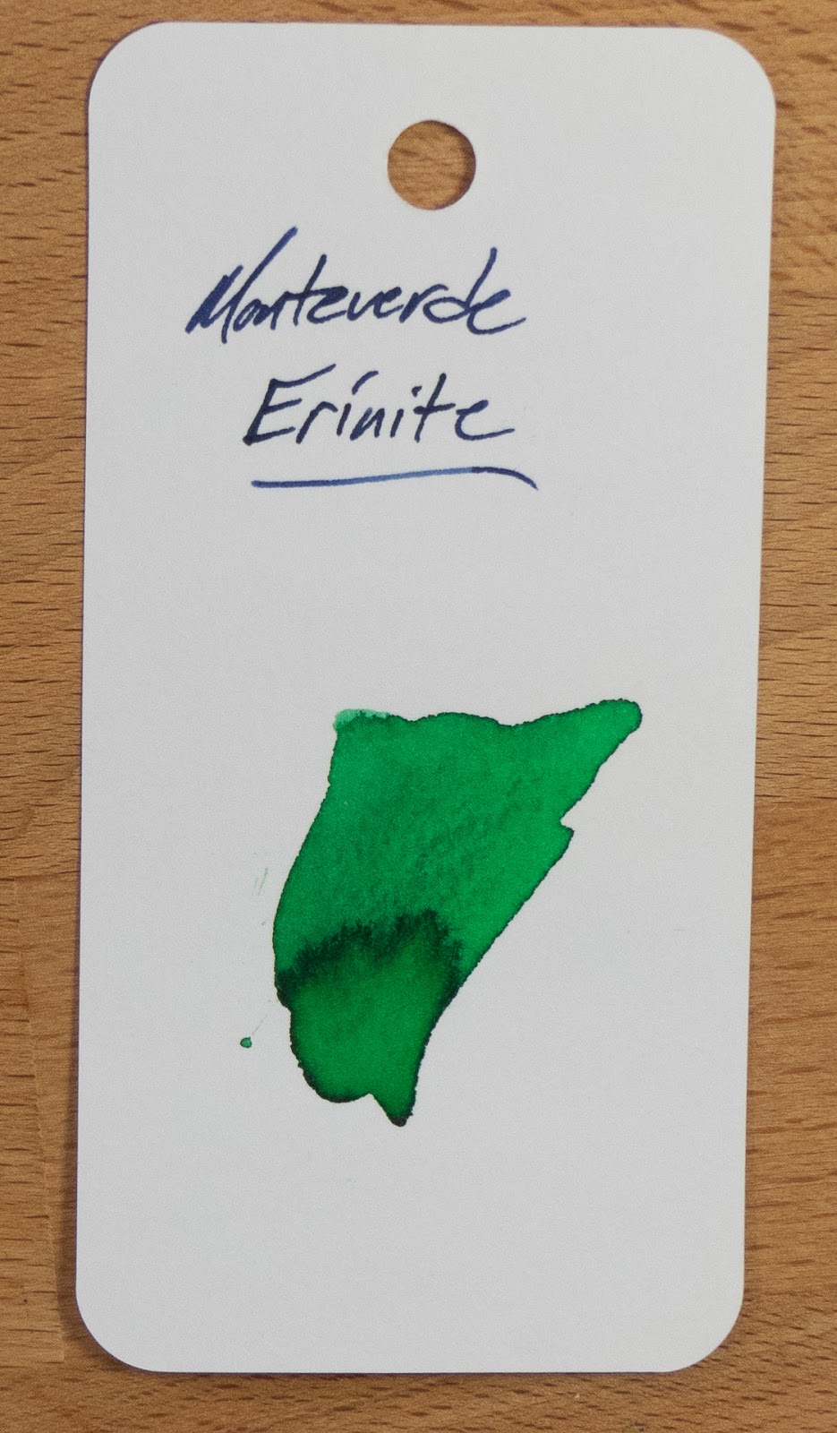
Monteverde is one of those ink companies that seems to fly under the radar. I'm not sure why that is. Perhaps it's because the inks are widely available and not all that expensive? Scarcity and a steep price seem to get the attention these days. Anyway, they're generally really good inks.

Contrary to form, one is only okay, and it's not really my cup of tea. It's a nice enough match for the gemstone that it's supposed to emulate, but that gem is fairly light and so the ink ends up being too pale for me. I think that if it were about 1/3 more saturated I'd really like it.

Check it out below and look for it at any of the Monteverde vendors you shop with. It's available in 30ml and 90ml bottles as well as samples. I'd go with a sample on this one but, at $8 for the smaller bottle, it's cheap enough to try out for fun.

Written Review:


Close-Ups!


Staples 20lb Copy Paper:


Tomoe River Ink Journal:


Inky Fingers Currently Inked:


Water Drop Test:


Chromatography!


Video Review:


Color Comparisons:


**I picked this ink up at the Pay It Forward table at a pen show. I'll be returning it to the PIF project for someone else to pick up and enjoy.**

Robert Oster Frankly Scarlet


Federalist Pens was the first US vendor for Robert Oster inks, and they marked their first anniversary with an ink called Frankly Blue. This year, for their second anniversary, they marked it with the release of Frankly Scarlet. As you can see in these images, Frankly Scarlet is a very dark red that's really more of a maroon to my eye. It's nicely saturated, and a little bit dry, but it flows just fine in the nibs that I used. I'd go for a wetter nib with this ink, though.

If you dig this ink, you can find it at Federalist Pens (link above) or at most other Robert Oster vendors. 


The Bottle:

Robert Oster's inks always come in these tall 50ml bottles. They're good bottles, with a big enough mouth to fit any fountain pen, though their shape means that you might have a hard time reaching the bottom when the ink gets low enough.


Written Review:


Close-Ups!


Staples 20lb Copy Paper:


Tomoe River InkJournal:


Inky Fingers Currently Inked:


Water Test:


Chromatography:


Video Review:


Color Comparisons:


This last one is more like what I think of when I think of scarlet.


**This bottle of ink was provided for review by Federalist Pens. No money changed hands, and no promises were given. WYSIWYG, YMMV, etc.**

Platinum's Procyon

10/8/18

This is a new pen from Platinum that iterates on the success of the Preppy and the Plasir. This one doesn't take the same nib/section, but the shape is unmistakable. Check it out in the video below.


All manner of cases from Nock Co.

10/7/18