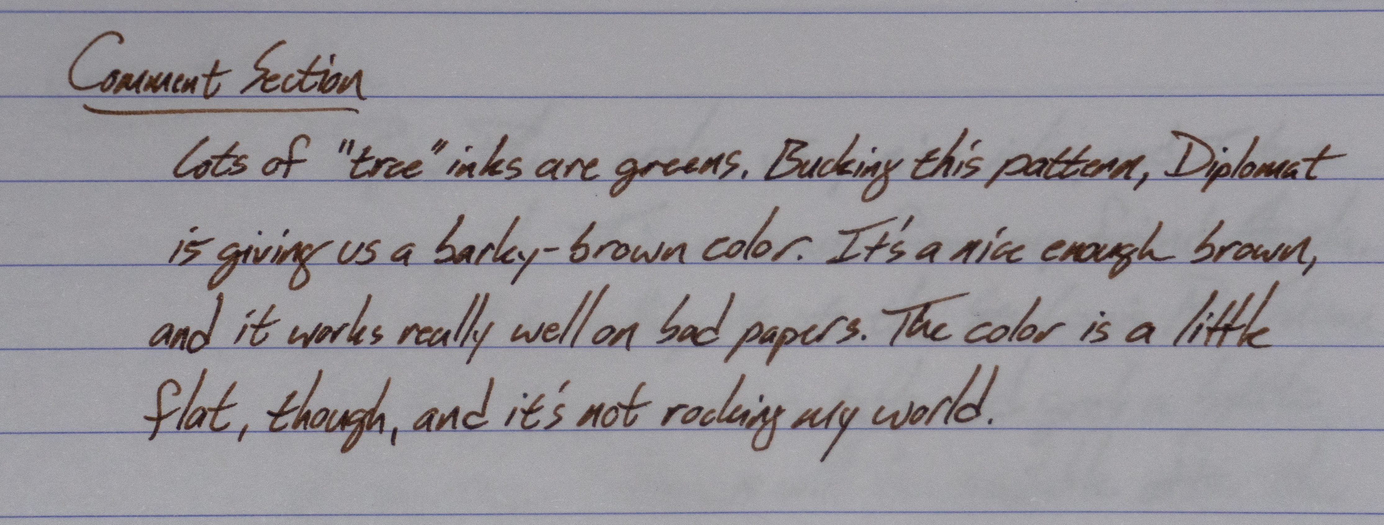
Until a few years ago, Aurora was a company that only had 2 inks. They had a Black (that is great) and a Blue (that is not good). Then they expanded to a Blue-Black that I wasn't a big fan of. Now, well, there are several colors! This brown is a little too dark to be a sepia, I think, but it's a nice brown.
I actually wrote and filmed this review back in 2020, and then it got lost in the shuffle. Oops!
**This bottle was given to me by Kenro, the Aurora distributor for the USA. I try not to let that sort of thing influence my reviews. What you see is that I got.**
I knew as soon as I saw this ink on social media that this was an ink that I really wanted to try out. Penn Chalet was kind enough to send it out for review. Thanks Pen Chalet! This was the first Wearingeul ink I'd tried, and it is a bit of a weird one. Maybe not the best place to start with the brand, honestly.
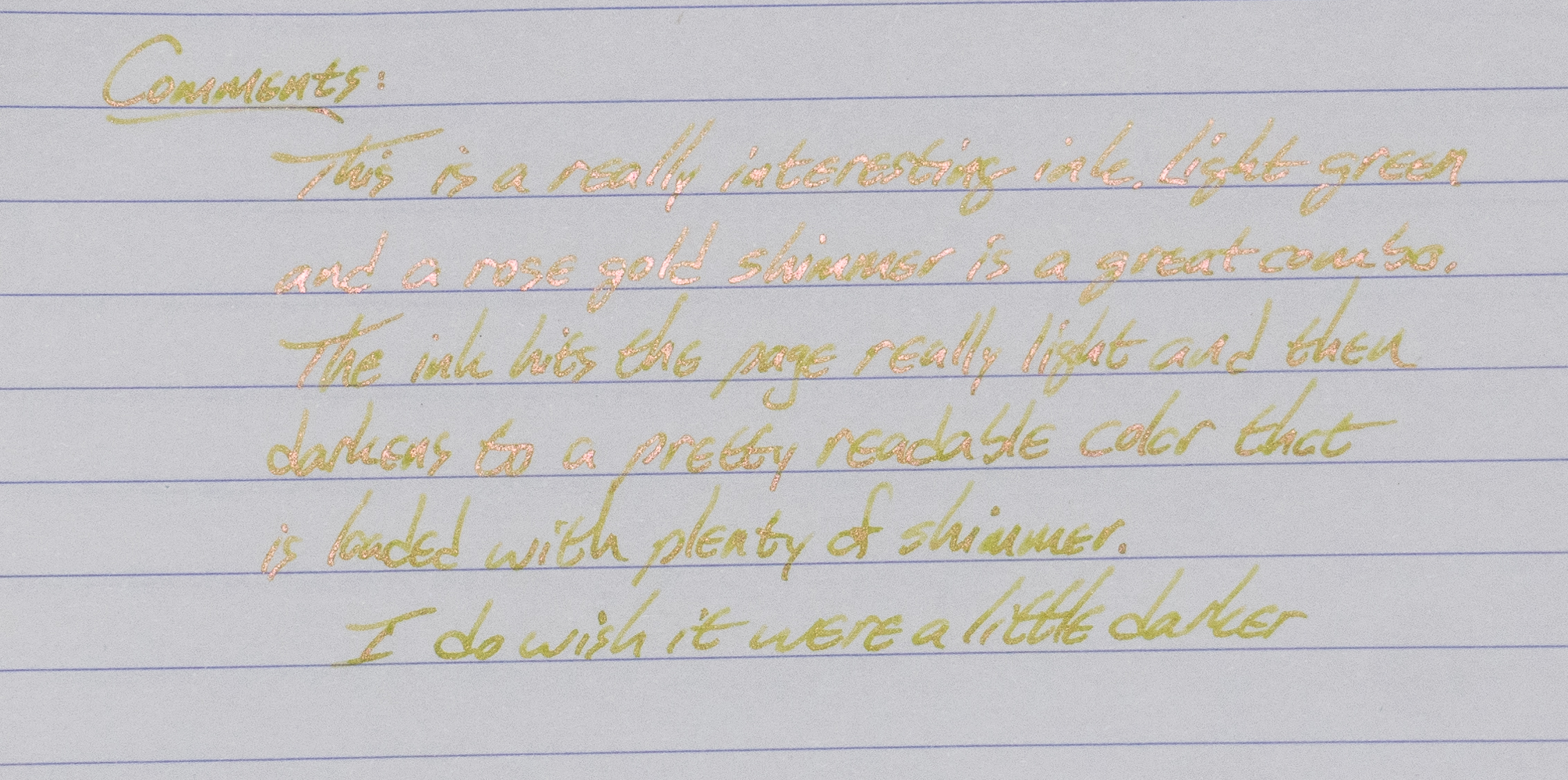
Taming of the Shrew is a light yellowish-green with rose gold shimmer. The shimmer is nice and fine, and I didn't experience any clogging with this ink. In fact, that shimmer is the star of the show. The green goes down on the page almost invisibly, but it darkens over time to a comparatively readable color that is really set-off by the shimmer.
At the end of the day, I wish this one were darker. I know there are going to be lots of people that are going to love this Pen Chalet Exclusive, but I prefer my inks to be more heavily saturated and more readable
Close-Ups
Honestly, I think this one is better in real life than it is in photos. The shine off of the shimmer make the text a bit hard to read on these photos. In actuality, it's easier to read with your eyeballs than with a camera.
There's just about zero water resistance with this ink, so keep your coffee and iced tea far away from your journal. Some of the shimmer will stick around better than the ink does.
Chromatography
Copy Paper Test
This ink is pretty darn good on the copy paper. Very little bleed or feather on this bottom tier paper.
Maruman Croquis Paper
Wheat Straw Paper
Often, these low-saturation inks are going to look better on more absorbent papers, and that's the case here. It soaks in a bit more and it makes it look darker than it does on the preceding papers.
Tomoe River Paper
And, weirdly, it looks great on Tomoe River. I didn't expect it to look very good here because it can't soak in, but it proved me wrong.
Color Comparisons
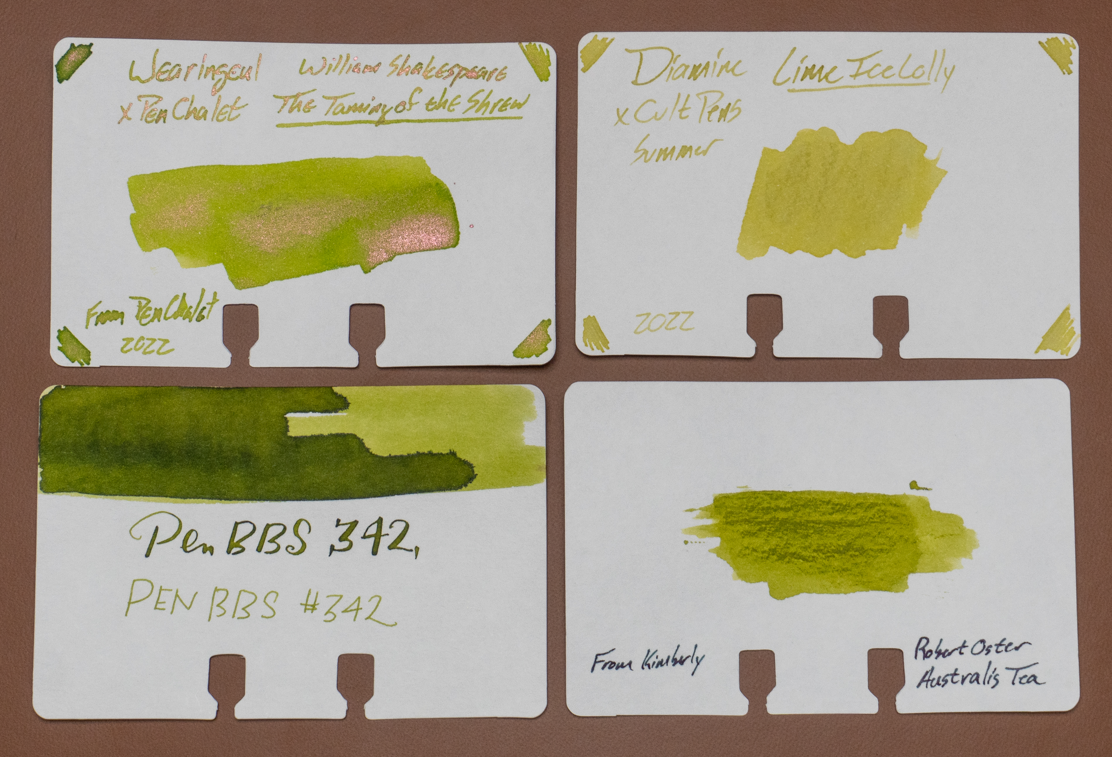
I don't have a lot of inks that were close enough to show off here. It's not a hue that I gravitate to, but it does look a little like a couple of these. No dupes, though.
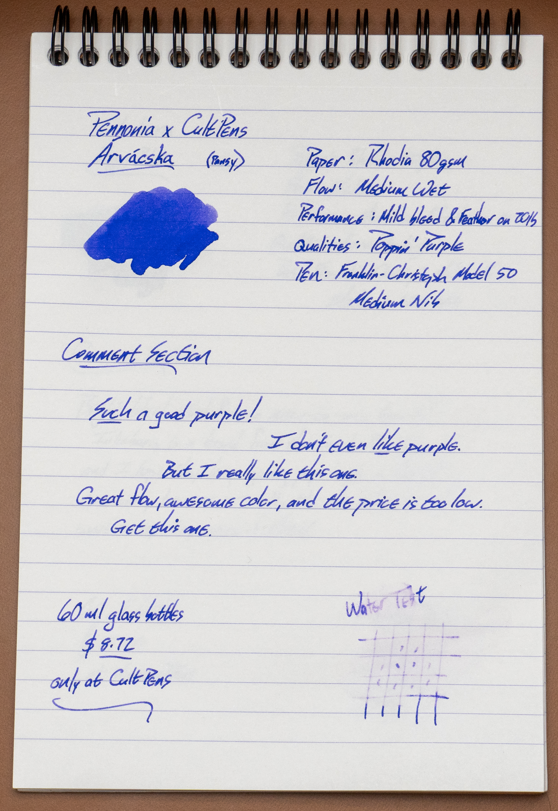
Y'all, this is a really good ink. I was already turning a corner on the color purple, but this one was so impossible to ignore. It's great. The color is excellent, the performance is very good on bad copy paper, and the flow seems perfect. Add to that that it's a very rare shade of purple (I only have one that's close to it), and it's an ink you shouldn't miss.
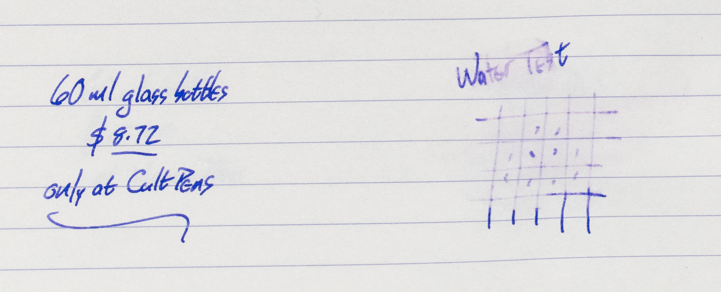
This name is a difficult one to say, (unless you're Hungarian) but it translates to pansy, and I have yet to find a bad pansy ink. So, get yourselves over to Cult Pens and pick up a bottle of Arvacska. You won't be disappointed.
Now, as with all purples, it's difficult to render on a camera. I've adjusted these photos so that they're as close as I can get to the right color on *my* screen, but it might not be perfectly represented on your screen.
Close-Ups
Close-Ups
Poppin'. Purple.
Chromatography
It's interesting how simple this chromatography looks.
20lb, 30% Recycled Copy Paper Test
This is pretty darn good performance on this bad paper. You gotta expect some bleed through on this stuff.
HP Premium 32 Paper
Tomoe River Paper
It almost glows.
Wheat Straw Paper
Good here, too. The wheat straw paper isn't coated, but it is very smooth and this ink liked it.
**
I bought this ink from Birmingham Pen Co. I try not to let that sort of thing
color my reviews. What you see is what I got. Thanks for the support,
Patrons!*


.jpg)
