Do you have an ink dependence? I can help...

Image Slider

Franklin-Christoph's Terra Firma vs. Montblanc's Leonardo Red Chalk

9/24/15
I reviewed Franklin-Christoph's Terra Firma last week, and a reader (Hi Mark!) asked me how close it was to Montblanc's Leonardo Red Chalk, which is a limited edition ink from a year ago.

My first reaction was "They're completely different. Not even close."

Then I got to thinking about it, and then I got to looking at pictures of that Montblanc ink, and then I said "You know, they're not that far off!"

Today I've inked up another pen with Leonardo to test them side-by-side, and they're really close. Terra Firma isn't a dupe of Leonardo, but it's just down the street from it.

Check it out:

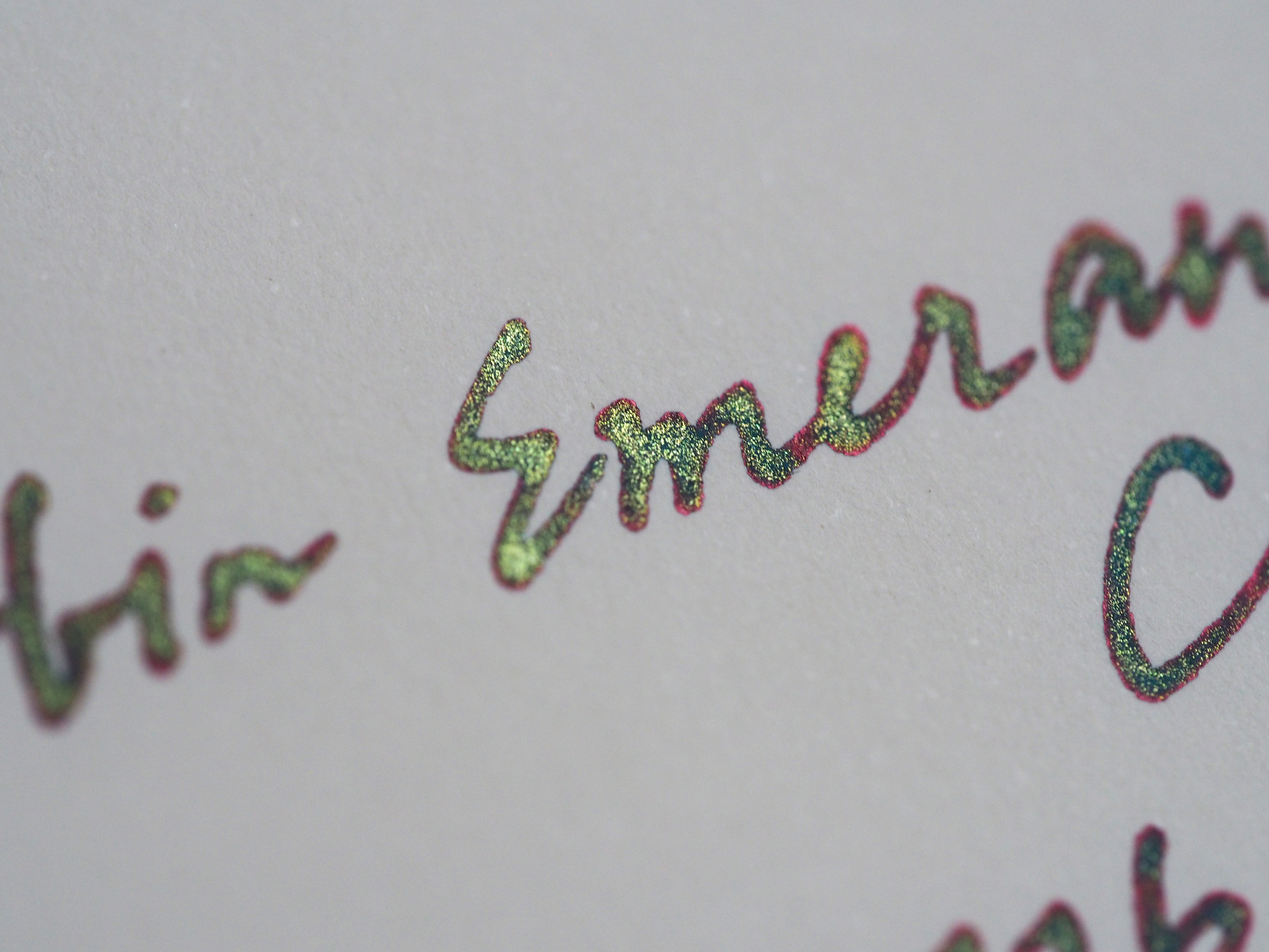
These are the popular Mnemosyne Word Cards from Maruman. It's an interesting paper that seems to soak up ink while still showing the shading.


This last picture shows the two side-by-side on a Lamy tester pad that has some really smooth paper. It shows shading in a way that lots of papers miss. They're a bit further apart on this paper, but it's really just in the shading. Terra Firma is more brown, but it's really close.


So, if you missed Leonardo, or you just want a slightly more brown version of that ink with a lower price tag and a larger bottle, go to Franklin-Christoph's website and grab some Terra Firma. It's pretty rad. 

**I've just noticed that Anderson Pens has FC ink now. I don't know of any other vendor that does.**

Dave Rea's cool post: TWSBI Eco a much better bet?

I'm not going to repost any of Dave's images and such, but if you're interested in why TWSBI pens might have cracking issues, and why the ECO seems to have fewer of those, check out his post.

Sailor Kiwa-Guro Pigmented Black

9/22/15
This is an ink that my friend Lori introduced me to this summer, and I like that sample so well that I had to get a bottle. It's my favorite black right now.


Periscope?

9/20/15
Hey folks,
Would anyone watch a thing if I lit up periscope and answered questions or something?

Just curious. It might be fun, but I don't want to talk to myself if I can help it.

Franklin-Christoph Terra Firma

9/17/15


This is one of the four new inks that I got from Franklin-Christoph at the DC Pen Show (Thanks for the samples, y'all!). It's a great reddish brown. That's the third brown in ink this collection.  Franklin-Christoph knows what I like. Seriously. Audrey asked me what my favorite ink was, and I went "uhhh..." So she decided to narrow it down: "What's your favorite brown ink?"

"Uhhhh..."

There are so many good browns out there. Three of them are in this one set of inks. Bravo, FC.

Written Review


The hue of this ink really seems to change depending on the nib you use. The Franklin-Christoph 27's broad stub makes this ink appear to be a really beautiful red-brown, while the medium italic on the 03 makes it appear much darker.

Close-Ups


 Full Sun Pics


It was a really beautiful day in NC, so I took some pictures in full sun to really show off this ink. There's no sheen or anything, but it still looks rad.


Copy Paper Test

There's more bleed with this ink than there was with the other two browns, but it's still not over-the-top. There was some with the broad stub nib, but it's a wet nib so I wasn't surprised.

Chromatography


Ink Comparisons

You can really tell the difference between this reddish brown (which reminds me of the clay in my back yard) and the Tsukushi below it. Tsukushi is a great brown too, but it's a really different flavor.


Video Review &Water Drop Test


You can (and should) get this ink from Franklin-Christoph's website where it goes for $12.50 in a 2oz bottle.

****It's also available from Anderson Pens, now.****

******Also check out this post to see how it compares to Montblanc's Red Chalk Limited Edition.*****

**This ink was given to me as a review sample. The review can only reflect my experience with the ink, and your mileage may vary.**

J. Herbin Emerald of Chivor

9/14/15

Oh, the fountain pen community loves their sparkly inks from J. Herbin. This is the fourth in that series of 1670 inks with their bright gold sheen. I would love to see them switch to some other color, but that doesn't seem to be in the cards.

This one is a bright blue with some really great sheen (if you have a wet nib and good paper). Look around online and you'll see some really fancy writing with this ink.  The folded nib work is the best, I think.

Written Review

 You'll see that there are plenty of errors in this review. I wrote it late at night when I should have gone to bed. I just didn't want to mess with getting the pen writing again the next day. This particular ink is great at first, but it tends to stop up the pen real good if you leave it in the pen overnight. I have to pull the nib and feed and rinse them off every time to get it going again. That's kind of a bummer.

This was taken indoors with full-spectrum lights.

Also indoors.

I was super tired when I wrote this review. Thus the errors. Oh well.


This one was outside. You can really see the red sheen and some of the glitter in this one.


Comparisons!


Copy Paper Test


The Flakes!


You tend to get a lot of glitter settling to the bottom of the bottle in these inks. Same thing happens in a converter. Just give it a little rotation or a little bit of a shake to re-suspend those flakes.


Chromatography!


Video Review


At the end of the day, I don't think I'll be buying this one. The color is nice. The glitter is fine. The sheen is really good. The problem is that it doesn't flow for me, and I don't have the patience to clean out a pen all the time.

On the other hand, it seems to work really well in a Nib Creeper, so there's probably hope for this ink.

It goes for $26 in a 50ml bottle.

Cursive to the Classroom

9/8/15
Last February, I posted about a Kickstarter (which succeeded, by the way) that would be used to launch a new tool for learning to write in cursive. That book was successful, and the new step is getting it into the hands of kids and teachers.

Lots of people that I talk to are concerned that kids won't be taught to write in cursive. Teachers have a lot of demands on their teaching time, but a system that can teach kids to write cursive more quickly and efficiently might just make it into a packed curriculum. 

Check out this site for information about the Indigogo campaign and to see how you an help out.

Regal George Fountain Pen

9/5/15

The Regal brand is a new one to me. That's actually why I offered to review these for Massdrop a few months ago.  As a result, I'll have several of these to show you in the next several weeks.

First up is the George. It's a simple name, but this pen is fancy. It's mostly silver and gold with just a little bit of black fill in the scroll-work at the base of the cap.It's not the sort of pen that I would generally pick up. Too much silver and gold for my tastes. After carrying it around for a while, I've grown to like it.

A new pen in the mail!

9/3/15
So, I've been talking to Ron at Pen Chalet, and he sent me a pen.


Cool, right? That's my first Sailor 1911 (and only my second Sailor). I'm pretty excited about that.