
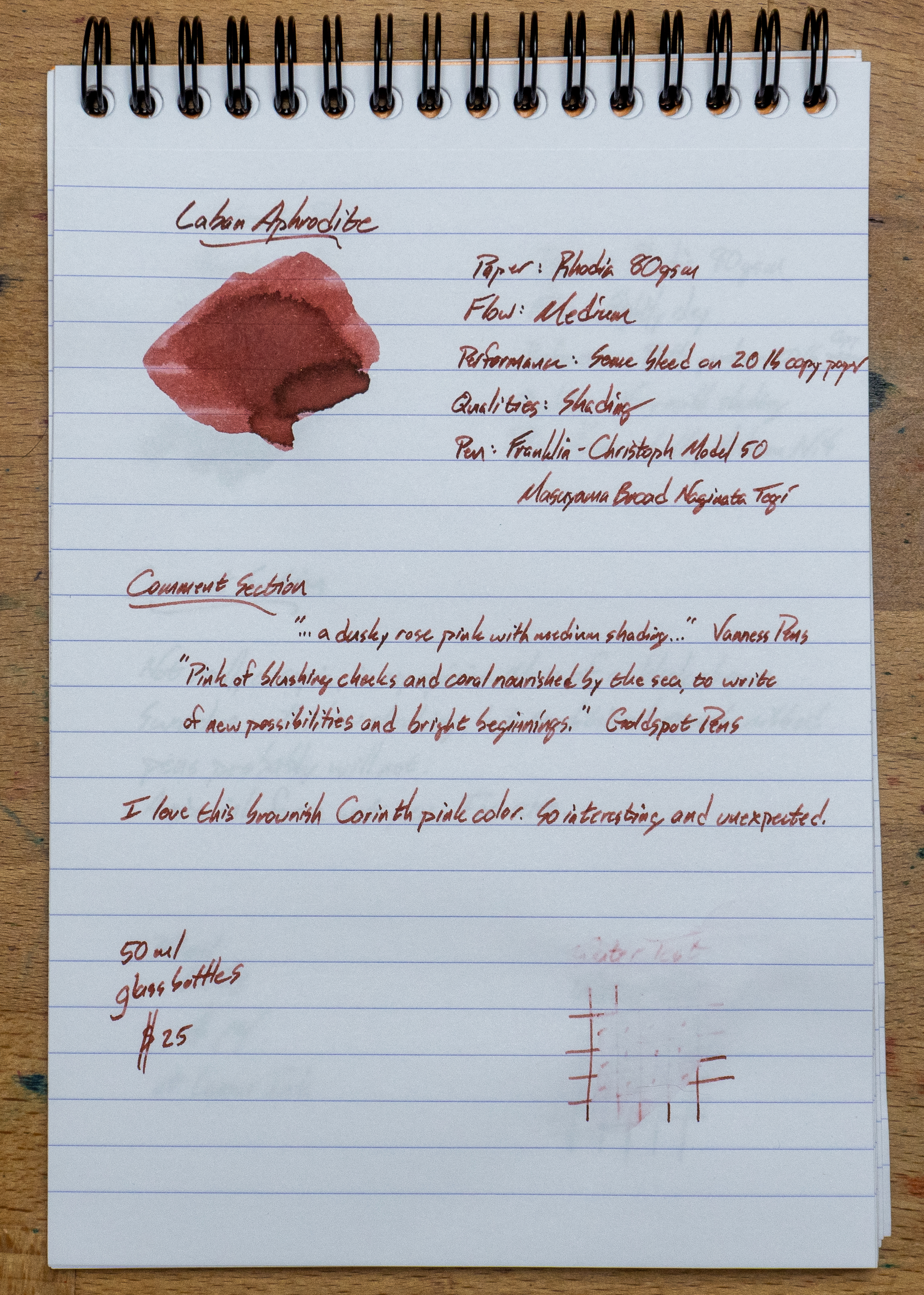
This is the first Laban ink I used, and it didn't disappoint. I probably wouldn't have bought this ink based on the label color. It looks like it's going to be a soft, inside-of-a-seashell sort of pink. Fortunately, my friend Sarah showed the real color to me and said I needed to grab it ASAP. So I did. And it's a really interesting brown-pink. Check it out below.
My only complaint is about the bottle. It looks nice, but the opening is pretty small, and that can make it difficult to fill a pen. I could do it, but only just. Make that opening wider, Laban. Don't change the ink, though. It's unique.
Full Page Review
The color is great, the flow is nice, and the marketing descriptions are solid gold. The only weakness is that water resistance. Or, you know, not-resistance. Aphrodite needs to stay away from the water.
Close-Ups


Chromatography

20lb, 30% Recycled Copy Paper Test


Tomoe River Paper

This is a really interesting color and it looks good on the TR paper.
Wheat Straw Paper

This is my favorite look for this ink, though. The wheat straw paper in this Inky Fingers journal isn't coated and it really makes this ink look soft and shady.
Domtar Bold 28 Paper (from Blank Slate Paper)
DOMTAR works well with this ink, too. It's really been good on all of these papers, and I've refilled this Franklin-Christoph model 50 with this ink several times. I just kept on using it.
Color Comparisons (on col-o-dex and col-o-ring cards)

I knew I wouldn't have much that was like this color, and these three inks were as close as I could find in my collection.

Video Review
** I bought this ink from Dromgoole's. I try not to let that sort of thing color my reviews. What you see is what I got. Thanks for the support, Patrons!*


.jpg)

Post Comment
Post a Comment