Do you have an ink dependence? I can help...

Image Slider

Franklin-Christoph Dark Denim

6/28/13
Back in April, I posted that Franklin-Christoph was getting into the ink game. I wanted to get some of that ink right off, but time passed and I didn't get a chance to try any of this ink until recently. Then, at the Raleigh Pen Show, I met the guys from F-C, and they were nice enough to give me a bottle of each ink so that I could try them out and review them for you.

Dark Denim is the first of the 4, and it's a winner, if you ask me. I'm a sucker for a good blue-black, and this is a good blue-black. It's on the blue end of that spectrum, but there aren't any green tones in this ink. Most other blue-blacks are at least a little green at times, but this one doesn't seem to do that. Unless you are using it in a really dry nib. The picture at right is of text done with the JoWo nib from my TWSBI Vac 700, and that nib is insufferably dry. It looked a little bit green from that nib, but the line is pale and watered-down because there's hardly any ink hitting the page.

The same ink in my Conklin Crescent's 1.1 stub is a rich, dark blue-black that looks entirely different.
Here you can see all three of the nibs that I used with this ink. 
Add caption

My usual review write-up is done on Rhodia with the Conklin's 1.1 stub and my TWSBI's Knox M nibs.


The saturation is high enough to give you a solid line on the paper, but low enough to give you a good amount of shading if you have a broader nib or better paper. I used both a broad nib and good paper for this review, so your mileage may vary if you're writing on notebook filler paper with an XF nib. I think you will want a pen that is slightly wet for this ink though, so that the color can really stand out.


As you can see, I keep quite a few blue inks around. Dark Denim is (from what I've seen elsewhere) pretty close to Diamine's Denim. I haven't tried that one out, yet, but I can tell you that Franklin-Christoph's secret ink-maker has done a good job with this ink. It looks like denim, it doesn't feather or spread, and it doesn't bleed.

Here's the video review and water test. Enjoy!


Spoiler:

Not terribly water-resistant. 
**This ink was provided to me by Franklin-Christoph at no charge. This review reflects my experiences with the ink, and I do my best not to be swayed by their largess. No money has changed hands, and my review is my own.**

De Atramentis Ink Sample Haul

6/27/13
Hooray for getting lots of inks in the mail! The Goulet Pen Company was getting rid of a bunch of De Atramentis inks, and I ordered up a bunch of samples. The shipping was about the same as the cost of the order, but them's the breaks. I also picked up a couple of Noodler's samples and a pack of their empty vials so that I can decant some samples of my own.


George Washington, Terra di Sienna, and Olive Green are all interesting inks. The black looks a little average, but Terra and Olive are both really interesting. Olive went down a little pale, but it darkened as it dried, and I'm excited to start using it.

 
Of the next three, Mouse and Bordeaux are the ones that I'm most looking forward to. Bordeaux looks a little darker to my naked eye than it appears in this picture, but it is really a matter of lighting.

 
Graphite black is a smooth off-black and Coffee smells like coffee. I don't know that it looks like coffee, though. It's more like light coffee beans than brewed coffee. It's a rich color, though, and I haven't had many browns lately.


These last two are the only non-DA inks that I went for in this order. Luxury blue is a color that I've read about, but I've never used. Blues are really my favorite, so I had to try it out. It's an expensive ink, but it might be worth it. Upper Ganges is also an expensive one, but I used up my last sample way too fast. I had to get more. It's a great ink.


 This is the back of the page I swatched these on. The notebook is one that my wife brought back from Cambodia. It's hand-made there, and the paper is actually pretty high-quality. The ink bled through a little, but it didn't get on the next page (aside from a couple of small dots).


Visconti's Sepia

6/21/13
This is the first Visconti ink that I've had the pleasure  of trying out. I picked this bottle of ink up from a sale at a website that I can't recall. I remember that it was a good deal for the ink, but that the shipping cost took the total price back up to about $11 or $12. That's still a pretty good price for this ink, which runs in the $17 range. The bottle itself (which I have (cleverly) not photographed) is the really attractive bottle you'll see when you watch the video review at the bottom of this post.

I wasn't sure what to expect from a Visconti ink. Their pens tend to be a little wild. They're wild in a way that I'm totally into, but they're a little wild. Fear not, Sepia isn't a wild ink. It might be "wild" as far as sepia inks go, but that's definitely on the mild side of wild. You're unlikely to be wow'd by this ink.

It's a brown that is more red and a bit darker than you would expect a sepia to be. It flows well, though perhaps a bit on the wet side of medium. It was fine in the fine nib I was using, but I could see it being a little wet in a broad nib.

That said, you'll almost certainly be satisfied with this ink. It doesn't feather. It doesn't bleed. It doesn't spread. In short, it's well-behaved.

If you want a nice brown ink, then check out Visconti Sepia. It's a perfectly adequate ink, but I don't think it's really worth the high price-tag.


I didn't have any brown inks at the time I was writing this review, but I think the photo is accurately representing the color.

So, is it water resistant? (You'll notice that I say "sepia" incorrectly.)


Organics Studio Edgar Allen Poe

6/14/13

I've been critical of Organics Studio in the past. Well, Tyler has totally redeemed himself.

Edgar Allen Poe is a dark red ink with plenty of shading that behaves itself quite well on the majority of papers. It shades beautifully on Rhodia, and I've also had it perform well on printer papers and on the specialty paper that Anderson Pens sells.

It doesn't feather more than a little on a low grade Office Depot note pad, and it doesn't even quite bleed through on that paper. It will ghost heavily, but it doesn't spot onto the next page. In short, it behaves itself quite well even in a slightly wet pen with a broad-stub for a nib.

Where would I use this? Well, I'd certainly use it to grade with because it is not-black and it can handle itself on cheap papers. I've already used it to take some notes with because it's quick-drying and interesting to look at. If you're a letter-writer, then you'll like it. It's not quite formal enough for business usage because it does still present as a reddish ink even though it's fairly dark.

When I first looked at it, I thought it was a bit like Noodler's Black Swan in English Roses, but it's much darker. It's a little like Noodler's Red-Black, but it's not as dark, and it's more maroon. It's closest to the really dark red that Levenger's Fireball changes into when it oxidizes in a pen over some time. It's actually really close to Sailor's Jentle Grenade, but that ink is a little more pink/purple than Poe. So, among the inks that I've got on hand, this one is unique.


Organics Studio has also changed their packaging. Tyler has gone from glass jars, to glass bottles, to plastic bottles. They're not bad at all, and they're not going to break in transit or be as heavy as glass. If you're more interested in ink than in bottles, then you're going to like that change.


The mottling on these two images is kinda nice, eh?


I've been searching for a place in my house that has good natural light. I don't have a fancy camera, and it can't handle too much light or too little. It turns out that I've got really good light at the window off of my kitchen, but I have to kind of sit/kneel on the floor with the subject in one hand and the camera in the other with the subject just out of the light. Also, it has to be in the late morning.

Is it water resistant? See for yourself.


Sneak peak:


Not really.


***Disclaimer: This ink was provided to me by Organics Studio at not charge. The review, however, is entirely mine. I'm not swayed by free stuff, but I do welcome it.***

New Visconti Pininfarina (via FPGeeks)

6/10/13
Seriously, you gotta go check this thing out. It's amazing-looking. It's a retractable FP made of "Unidirectional carbon graphite." I don't know what that is, but I want it. It looks like you're writing with a classic car. Pininfarina designs Ferraris, but this reminds me more of something from the 50s. 


Go and check it out over there on Fountain Pen Geeks. I really hope that they have one of these at the DC Supershow so that I can drool on it. 

Just don't scroll down to the price...

June 2013 Goulet Ink Drop

6/7/13
The Ink Drop this time is a mystery set. I like this set of inks, but I don't really know what they are. I think I have a good idea for a couple of them, but it's going to be fun figuring out what they are.

In fact, that fun could pay off for anyone who wants to take a stab at guessing the inks. The Goulet blog (Ink Nouveau) is having a contest wherein people enter their guesses for the inks and those people who get each ink right will be entered into a drawing for a bottle of that ink.

I know I'll be entering, and I hope others will too.

Now...to dig up all of my ink swatches and old reviews...


In a little cross-promotion, I've swatched the Ink Drop on a pad that was given to me by the Andersons at the last pen show. It's some very high-quality paper, if you ask me, and I'll be talking about it more in the future.

***The Andersons provided me with the paper, but my opinions are my own.***
***I bought the Ink Drop membership, and it's unrelated to the pad of paper.***
***It's silly to have a list of only two things, so this is a third item to round it out. Hi Opal!***

Raleigh Pen Show, Day 2

6/1/13
Whew, it was a great day at the show. Audrey was dubious about my wanting to go back after having spent 3 hours or so there yesterday. We ended up being there for about 5 hours today, and we didn't even know it. If you haven't been to a pen show, but you're reading this blog, then you need to go. Just do it.

This year Raleigh's Pen Show saw lots of new custom pen makers. The variation in style makes each of these pens unique, and that's a feature that we can all appreciate.


I didn't take my good camera to the show. I should have, and I'll know better when it comes time for the DC show. These pictures are of some of the really nice pens made by Randy Fike at Cravelli Pens. He makes a wide range of pens in several different styles. The material is a secret, but I can tell you it has great depth and shine. Randy says that the material is made specially for him. They start at under $80, and go up from there.


The two pictures above are from Van Horne Pens. We spent a long time talking to the Van Hornes, and we learned quite a bit about their business and the pens. They're also a custom pen maker that uses a super-secret material to make their pens. There are swirly pens and pens that look like carious sorts of feathers. We watched them sell a rollerball with piano keys and a musical score on the barrel. He'll custom-make a pen with your choice of score, if that's what you're into.  And then there are some real stand-outs.


 The top picture is of a few of their new limited edition line. They run in the $800 range, but the material, detail, and workmanship are pretty fantastic. The barrels are very ornate, but I love the hammered look that he gave to the sections. These pens are art that you can write with. All of their nibs are Schmidt nibs (in steel or gold).

I really like the idea of this pen. It's made to look like a cigar when it is capped. The barrel is really fat because he wanted to make it fit the ring from one of his favorite cigars. The ring is actually loose on the pen so that one can change it if one wants. Pretty cool if you know someone who is a cigar smoker and a pen collector.

I put up a picture of Ryan's hand-made pens yesterday, but I didn't get a clear picture of these two pens at the bottom. They're clip-less pens with an asymmetric almost-cone shape. They feel nice in your hand, and they'll look really nice on the desk. Definitely worth a look at the webpage for much better pictures than I got.

We spent a long time talking to Hirsch and Terry Davis. He buys and sells vintage pens and she makes custom jewelry. Hirsch and I talked fountain pens while Audrey and Terry talked nail polish. Fun times for all. He introduced me to several different iterations of the Conklin Crescent filler that I'd never seen before.


And here's Pendleton Brown. He was sans ink-splattered jacket, but his pants made up for it. He's a character, and it's hard not to talk to him for a long time while he alters nibs and sells pens. I actually ended up buying a Conklin Crescent with a 1.1 stub nib from him. I've wanted one since I first saw them a year or so ago, and his price was awesome. I might have him alter my TWSBI nibs at the next show.


I actually didn't think to take any pictures of the Andersons, but we always love talking to those folks at the shows. They're awesome, and I don't know what a pen show would be like without them. If you want anything vintage or modern, you should check them out at Andersonpens.net. They've also got a great blog in both print and video.

I chatted with the guys from Franklin-Christoph for quite a while, and I found out a good deal about this super local brand. I ended up going home with one of their pens and all of their inks. Totally psyched about that. I hope to get out to their Raleigh office to look around and interview them about what they're doing and what's coming up on the horizon.

I also talked to Tyler from Organics Studio ink. He's a great guy, and set me up with several of his new inks. I tried some of them about a year ago (with mixed results), and I'm excited to see his improvements. Just from swatching these inks, I can tell they're vastly improved. He's been branching out, too. Pendleton Brown's new inks are OS, and I can tell you I wish I'd gotten a bottle of the Red Rubber Ball ink that I dipped my Conklin in to try out. It's still on the nib, and it's a nice red ink.

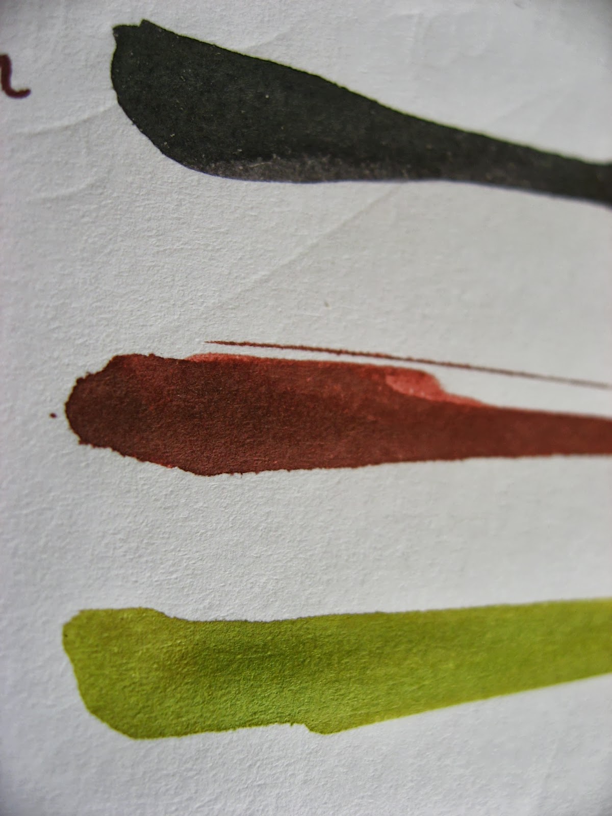
I'll have pictures of my new pens up soon, but here's a few pictures of our new inks to tide you over. Be looking for these in the near future.